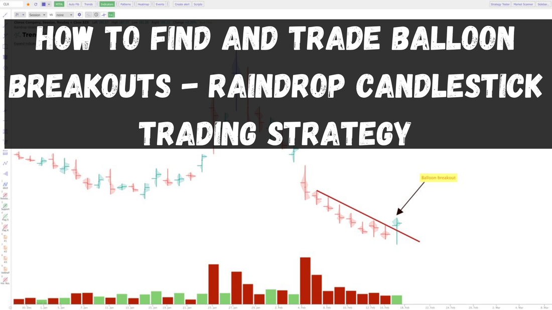
If you're familiar with Raindrop Candlestick Charts, you may be familiar with Balloon Raindrops. If not, don't worry, we'll explain the concept in this post and how you can screen for and use Balloon Raindrops in your stock trading strategy.
First, What are Raindrop Charts?
Raindrop charts are a unique type of chart created by TrendSpider. Here's a direct from their website explaining how they work:
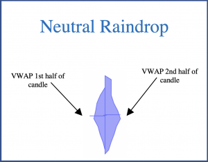
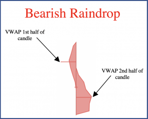
"The Raindrop Chart is a new type of financial chart that abstracts away arbitrary constructs, such as open and close prices, and focuses on changes in market sentiment. Rather than conveying price changes, Raindrop Charts incorporate volume to validate price movements and provide deeper insights. This makes it a compelling alternative to traditional candlestick charts that focus exclusively on price and require additional overlays to analyze volume. In a Raindrop Chart, each bar, known as a Raindrop, covers a fixed period of time and consists of the high, low, along with left and right means. The left mean is the mean price, weighted by volume, for the first half of the period, and the right mean is the mean price, weighted by volume, for the second half of the period." 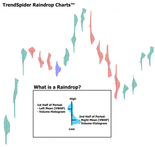
Source: TrendSpider.com
You can read TrendSpider's explanations about Raindrop charts in these 2 blog posts here, and here, watch any of these 2 videos here, and here, or for an in-depth explanation of Raindrops, you can read it's White Paper.
Now that you're more familiar with Raindrops, let's get into Balloon Raindrops.
Trading the Balloon Raindrop Breakout
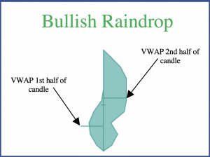
A balloon raindrop looks exactly like the way it sounds. Volume is more abundant near the higher end of the raindrop's range, both during the 1st and 2nd half of the time period. This creates a skinny bottom wick and a thicker top, that ends up looking like a balloon. It's a balloon breakout if it breaks through a key resistance level. Below is an example from a chart that we tweeted.
Green or blue balloon raindrops that appear at key levels and/or on higher volume can be bullish signals. They basically signal that volume was supported near the top end of a trading range. In the case of the balloon breakout, it adds extra confirmation, since a breakout is often confirmed with volume.
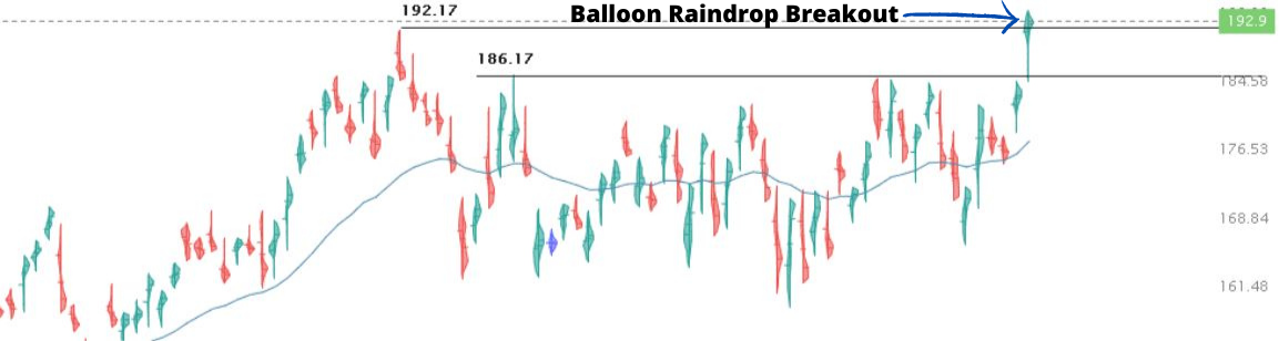
A regular candlestick chart breakout won't tell you if there was a significant amount of volume above the breakout range, unless you go into smaller timeframes to disect it yourself. You may think a stock has broken out, but if it did so on low volume above the breakout area, then it may not be as reliable. That's why balloon charts can help you. Below, is a balloon setup that we tweeted about a while ago. We posted it on the day of the balloon, and then it proceeded to go higher as you can see. The stock actually ended up exploding after that to almost $80 a share, but obviously that's not entirely because of the balloon raindrop. This was a bullish setup because it happened at a support level and because if you were to draw a downwards trendline, you'd see that the raindrop was a breakout. Our stop loss was under the swing low and our target was a retest of the highs. 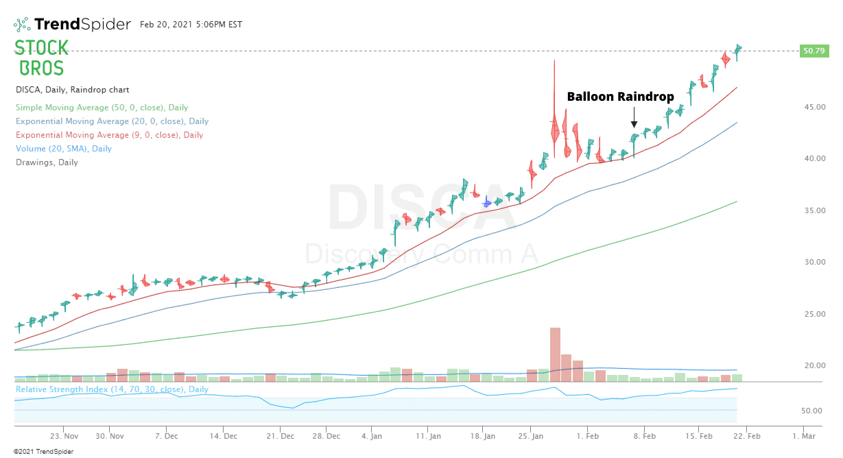
Here's another balloon breakout example with a video explanation from TrendSpider:
You don't always have to hang out on raindrop charts though. If you see a breakout or just an interesting setup on a candlestick chart, you can confirm it by quickly switching to a raindrop chart and seeing if a balloon was formed.
Below, you can see the difference between a candlestick chart and a raindrop chart. The candlestick had a long top wick which may seem bearish, however, the raindrop chart formed a balloon which saw the stock continuing higher the next day. 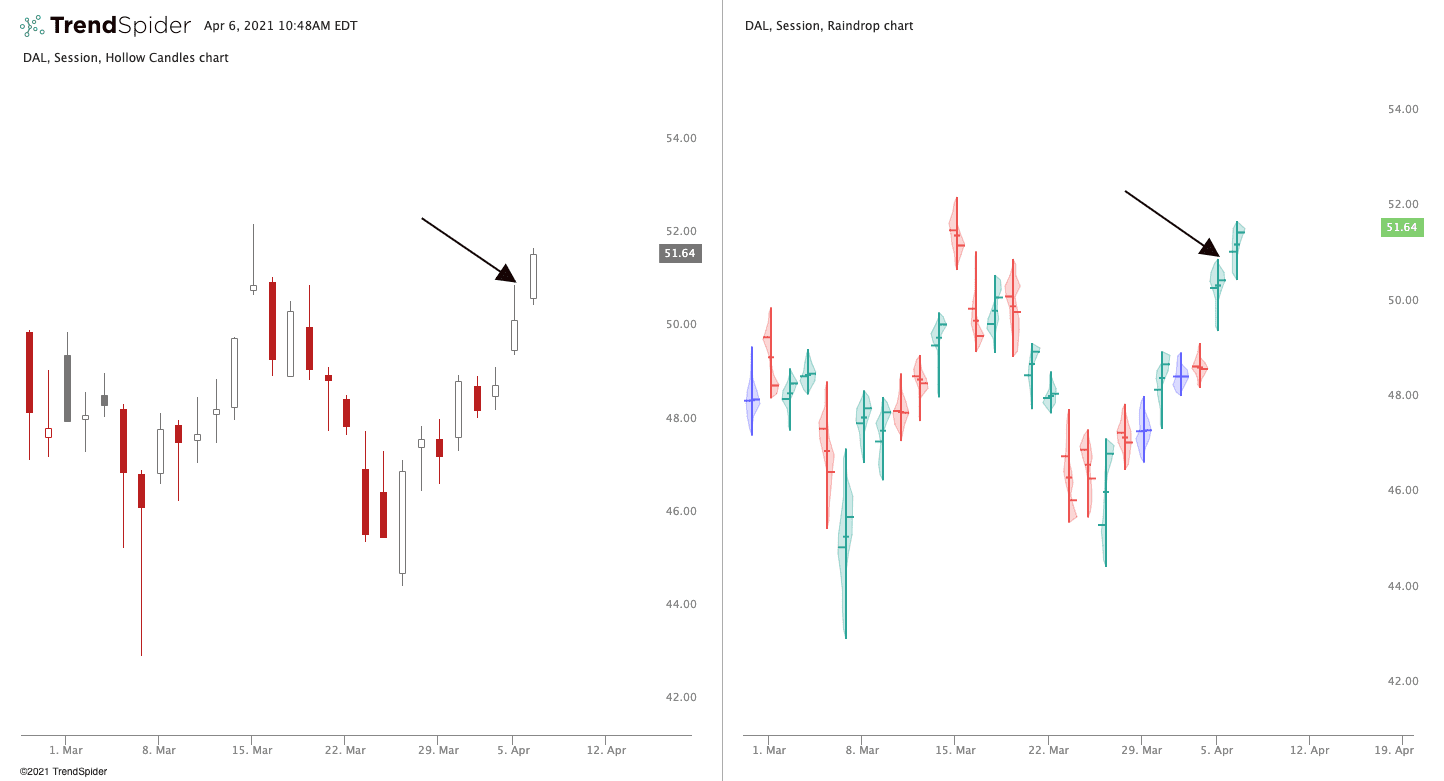
Source: @TrendSpider on Twitter
Now that you know what balloon raindrops are and how to analyze them, you gotta start looking for them. So let's talk about that.
How to Quickly Find Balloon Raindrops
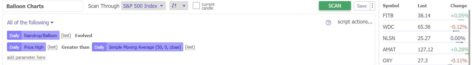
We use our "balloon charts" scanner on TrendSpider. This simple screener that we created simply looks for balloon raindrops that close above the 50 SMA on the daily time frame. Check out the criteria below.
Then, we just look through each chart and look for break outs or solid chart setups. It takes about 5 seconds to run the scan and it's definitely a useful tool that is unique to TrendSpider and we use it often.
After you've ran a scan, you can see all the results on the right side of your screen and the corresponding chart on the left, which you can easily scroll through with your arrow key. Here's an example of our Strong Stock Scanner that we've mentioned in a previous article to show you how a scan looks. 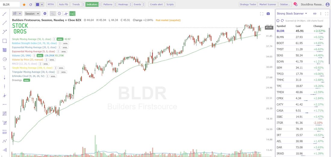
Thanks for reading! We hope the article was useful to you. If you enjoyed this article, please consider following us on twitter @StockBrosTrades and/or subscribing to our free newsletter to get articles like this sent to you when they are posted!
Need Chart Software?
TrendSpider is a top-tier charting platform where traders can put their technical analysis skills to work. It offers automated technical analysis tools, dynamic price alerts, back testing, 1-on-1 training sessions for those who need extra help, and more. As we mentioned earlier, a very unique tool that TrendSpider has is Raindrop Charts, which can give you a great edge with your trading.
Get 10% off TrendSpider plans by clicking here & using the coupon code TS10 when signing up. Related Category
|
 Categories
All
Archives
September 2022
|
 RSS Feed