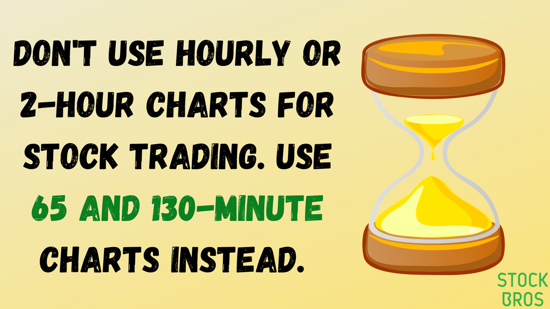
Don't Use Hourly or 2-Hour Charts For Stock Trading. Use 65 And 130-minute Charts Instead.10/24/2020
 Traders often toggle between various time frames when analyzing a stock. Common time frames for traders are the weekly, daily, 4 hour, 2 hour, hourly, 30, 15, 5, and 1 minute charts. Swing traders often use the 60 minutes or higher, and day traders typically use 30 minutes or less. While 2 hour and hourly (60 minute) charts can be good for futures or forex trading, it does not make too much sense to use these for stocks. We'll explain why in this article. 65 minute vs. 60 minute time frameYou may be wondering why we prefer to use 65 minute charts instead of 60 minute charts, as 65 minutes seems rather unorthodox. The answer is simple though; it's because of the hours that the stock market is open. Besides premarket and after-hours trading, the US and Canadian markets are open from 9:30am to 4:00pm EST Monday-Friday. That's 6.5 hours of trading, so why would you use an hourly chart? With an hourly chart, you'll be left with 6 hourly candles (or bars), and one 30 minute candle. Unless you purposely want one 30 minute candle at the end of the day, it makes sense to use 65 minute charts instead. With 390 minutes in a regular trading day, 65 minutes goes into 390 exactly 6 times. Therefore, you'll have 6 full 65 minute candles. Here's a 65-minute chart for AAPL: 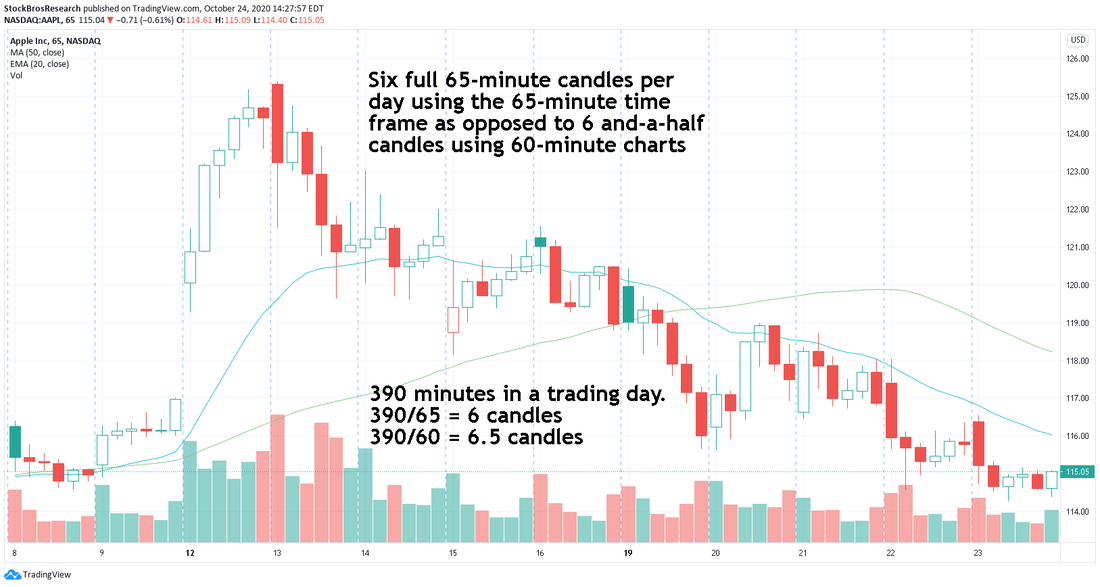 AAPL stock chart 65 minute time frame. Here's a 60-minute chart for AAPL: 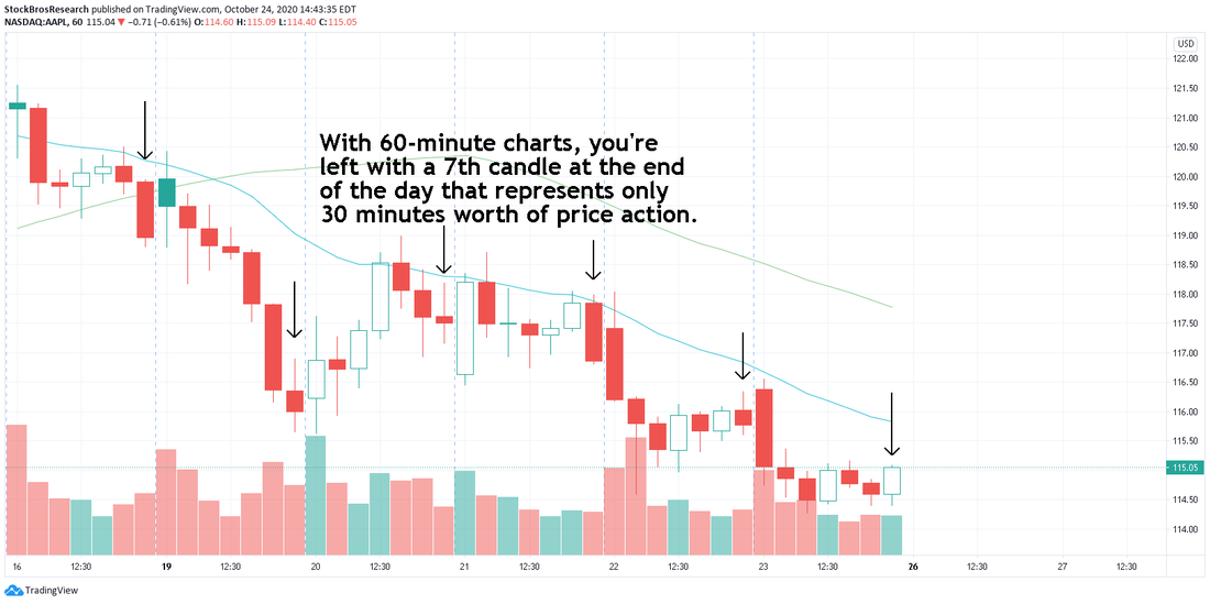 AAPL stock chart 60 minute time frame. Refer to the notes in the chart. If the writing is too small, you can click on the pictures. 130 minute vs. 120 minute time frameAlthough not as widely used from what we've seen, some people use the 2 hour time frame. For the same reason above, it makes sense to use 130 minutes instead as it will give you 3 full candles. 390/130 = 3. With 120 minutes you'll have three 2-hour candles, and one 30 minute candle. Again, not ideal. 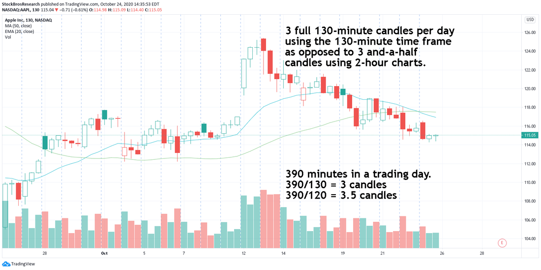 When NOT to use these time framesWe suggest that you do not use 65 or 130-minute charts if you have your charts set up to display premarket and after-hours data. Even hourly and 2-hour charts aren't good with extended hours. We show an example of this in the chart below, where the premarket/after-hours data is marked by the blue sections in the chart. As you can see, adding extended trading hours to the mix messes up the 65-minute chart below by making the first candle of the day (white area) start at 10:30 while the last candle starts 5 minutes before close (which keeps going into after hours so it still is technically a full 65-min candle, just at an awkward time). 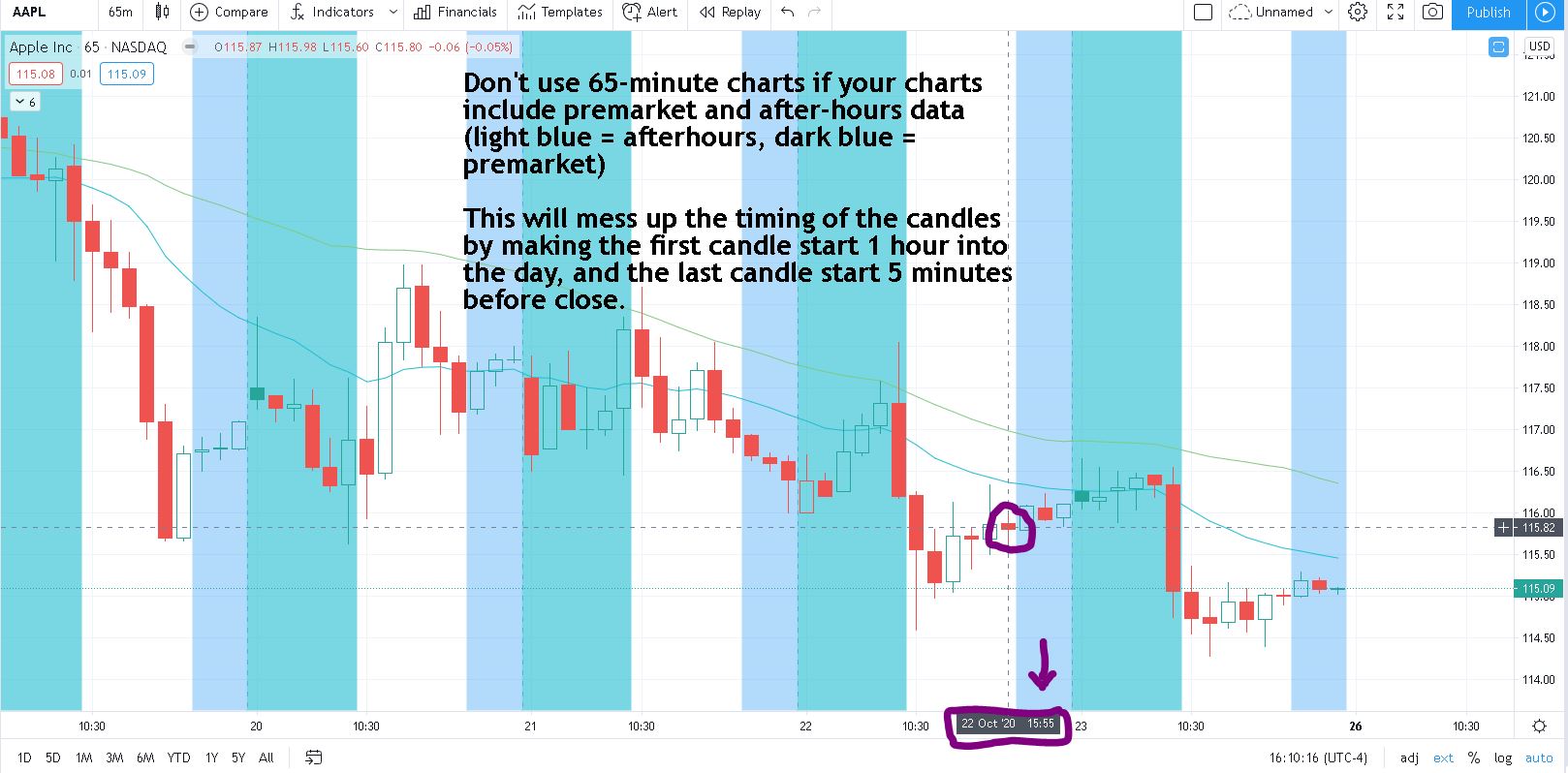 65-minute chart with premarket and after-hours data In regards to 130 and even 60 or 120-minute charts, they also gets messed up in a similar way. Therefore, if you're using non-regular trading hours, avoid these time frames. Instead, time frames such as 30, 15, 5, and 1 minute work well with extended-hours trading. ConclusionThe 65 and 130-minute timeframes are unorthodox to use, but they make sense if you think about it logically as long as they are used in regular trading hours only. These will make your charts "even" or "proper". Keep in mind, this only applies to stock trading as the market is open for 390 minutes. We do not use these time frames for extended hours or for forex/futures etc. If 60 or 120-minute charts have been working for you, then keep using them by all means. This article expresses our own opinion but ultimately, the choice is up to you. Need Charting Software?TrendSpider is a top-tier charting platform that we use where traders can put their technical analysis skills to work. It offers automated technical analysis tools, dynamic price alerts, back testing, screeners, 1-on-1 training sessions for those who need extra help, and more. A very unique tool that TrendSpider has is Raindrop Charts, which can give you a great edge with your trading.
Get 10% off TrendSpider plans by clicking here & using the coupon code TS10 when signing up. Thanks for reading! If you enjoyed this article, please consider following us on twitter @StockBrosTrades and/or subscribing to our free newsletter to get articles like this sent to you when they are posted! |
 Categories
All
Archives
September 2022
|
 RSS Feed