 Have you ever wondered what technical indicator can give you the extra edge that you are looking for when it comes to stock trading? Whether day trading or swing trading, for us, that indicator is volume. This post will show you how we like to use volume analysis for trading. Note: If any charts are too small to see, you can click on them to see the full image. What is Volume?Volume in trading is a measure of how many shares/contracts have traded hands in a specific period of time. For the purpose of this article, we will only talk about volume for stocks, not options or futures. For stocks, volume is the amount of shares that traded in which ever time frame you are looking at on a chart. When looking at daily time frames, each candle/bar will have different volume readings based on 1 days' worth of price action whereas 10-minute time frames will measure volume every 10 min, and so on. How To Use Volume For TradingIf you are looking for bullish setups, you want to see higher volume on up days compared to down days. Check out the arrows pointing to the volume patterns in the chart below. Volume is clearly heavier when the stock is rising, which is bullish. The longer the volume pattern plays out for, the more bullish potential it has. 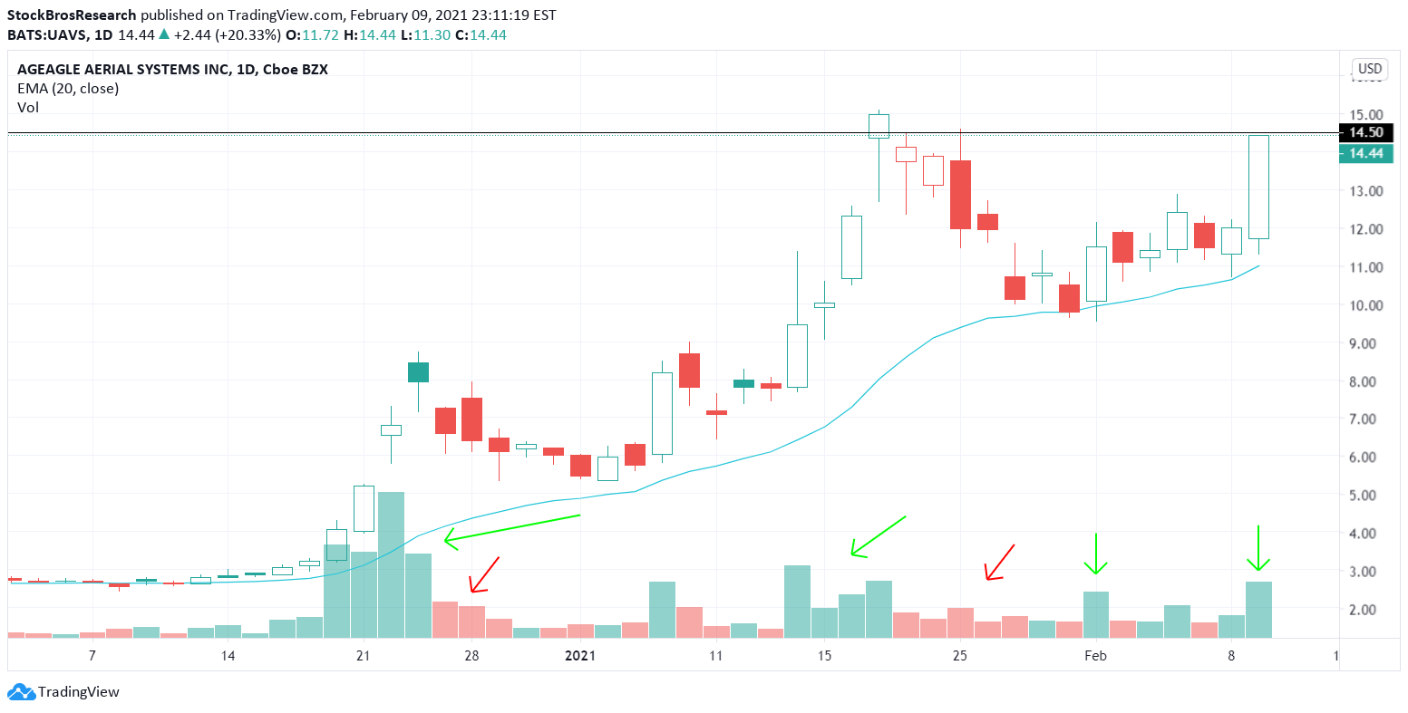 We took this trade and alerted it on twitter because of the bullish volume combined with a bullish chart pattern. It ended up hitting a target we had set above $14. Here's the tweet below: 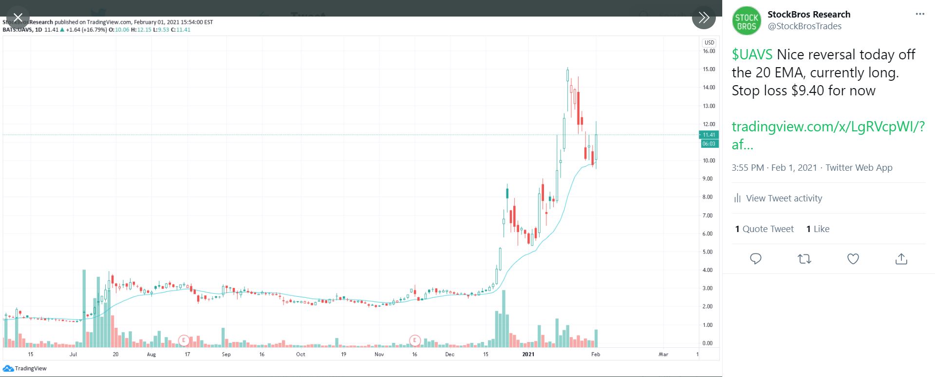 Below is another example of what to look for in terms of volume patterns, as you can clearly see the difference between green volume bars and red ones, which has supported this large move higher in TLRY stock. Currently though, TLRY seems to be showing signs of volume exhaustion, which is a topic we discuss later on in the article. 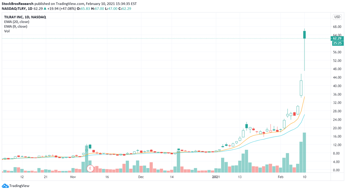 Volume increasing when a stock moves higher is confirmation that the move is REAL, meaning there's a lower chance of getting faked out. Stocks don't go up forever though, they occasionally pull back or consolidate in up trends. So, if the stock starts going sideways or slightly down after a run up, while volume simultaneously gets LOWER, that's a bullish sign. Check out the arrows in the BLNK chart below to see what we mean. 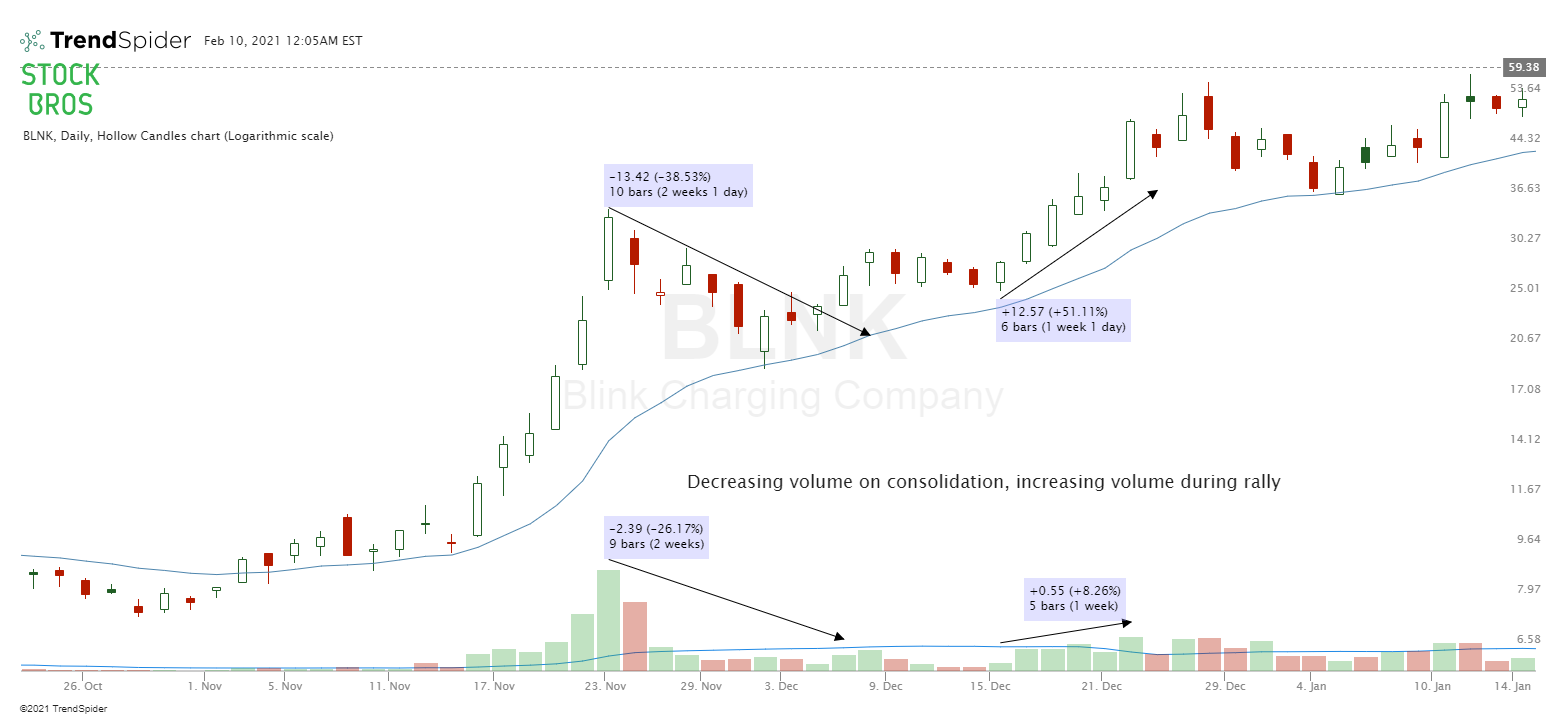 Think of it like this. If volume drops off during periods of consolidation after a big rally, that simply means there are not a lot of sellers for there to be large volume, which means that it is likely to be a short-term sell off before continuing higher again. However, sometimes you will see stocks go up a lot and then all of a sudden, big selling volume comes in. This is a potential indicator that the sellers could be taking over, and it isn't just a short-term sell off. Even the recent GameStop (GME) short squeeze, where GME went from $20 to $480 in just 2 weeks could have been predicted with volume patterns. We wrote a whole article about trading short squeezes which you can read here, and GME was mentioned in the article before the squeeze got really crazy. Volume is definitely a key indicator in finding short squeezes (at least for us), so it is something to get familiar with. How To Set Volume On a Stock ChartSome charting sites like stockcharts.com have volume as a preset indicator, but others like TradingView and TrendSpider may not. On TradingView, all you have to do is click "indicators" as shown below and search for "volume". It will look like the volume bars on the bottom of the chart shown below if you did it correctly. 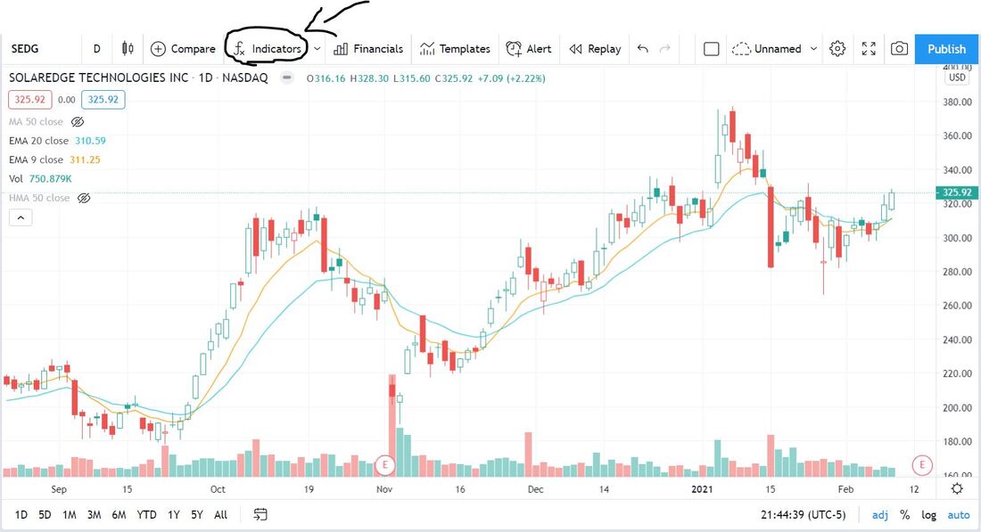 When editing the volume settings, we like to checkmark "color based on previous close", as it sets the color of the volume bars either green or red based on if the stock closed green or red. By default, it is NOT checked off. We feel that for our strategy, checking the box makes it easier to visualize bullish volume. You can also add a moving average to your volume bars which can help indicate if volume is relatively high or not. 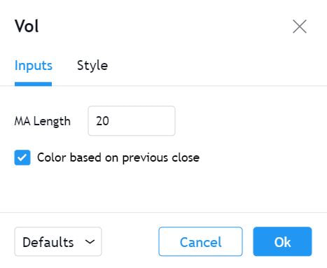 This is subjective and either way works but, we like having volume green on an up day and red on a down day. The default setting shows green or red based on the closing price of the candle versus the open price, instead of comparing it to the previous period candle close like how we have it set. TrendSpider currently does not have the option for color based on previous close, but nonetheless, volume works well with either setting and it is up to the trader to decide which setting is better for them. You can see the difference in the chart below, where one volume bar shows up green (based on previous close), and the other is red. 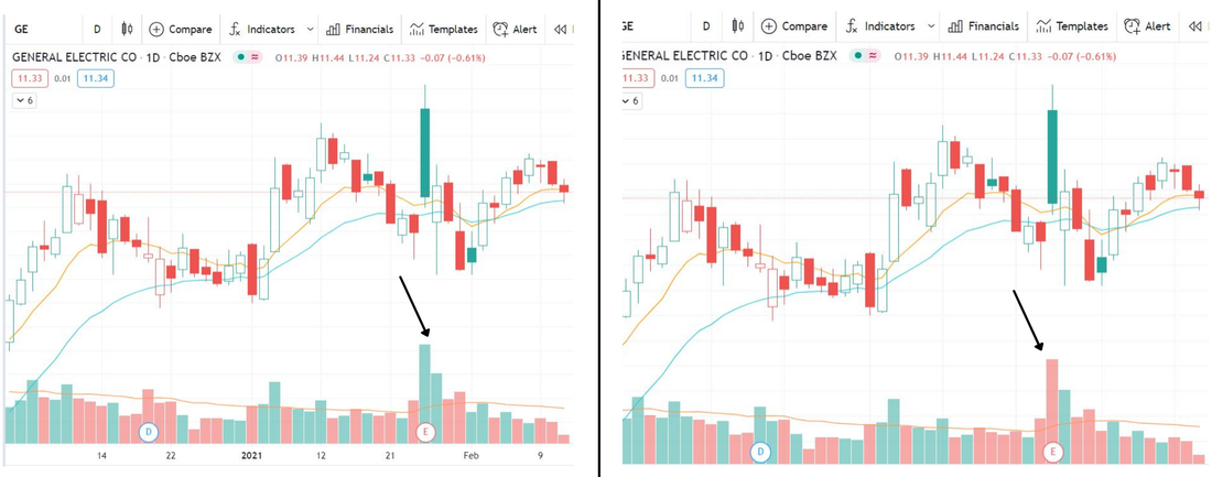 Volume based on previous close vs. volume based on current close. Look Out For Volume ExhaustionIf you are long a stock, and it keeps going higher and higher, and volume sky rockets at one point (usually accompanied by a big gap up), you could be looking at exhaustion volume. This is especially true if the big gap up candle ends up closing the day lower than where it opened. Exhaustion volume in an uptrend is bearish, and is bullish in a down trend. In an uptrend, this happens when everyone who wanted to buy has already bought, which is evident in the large volume spike. At one point, buyers become exhausted, leaving mostly sellers. Check out the chart below on AMC's stock. The stock went from $2 to $20 in just a few weeks, and daily volume went from around 30 million, to over 1.2 billion with a massive gap up in the last day of the rally. That's a HUGE increase in volume that shouldn't be ignored. Also, whoever was following that AMC trade knew that there were a lot of traders long AMC. It seemed as if everyone was long based on the sentiment around the stock on social media. When this happens, you should consider selling. It is NEVER wrong to take profits and you should never feel fear of missing out (FOMO) that would cause you to chase a stock that high up. 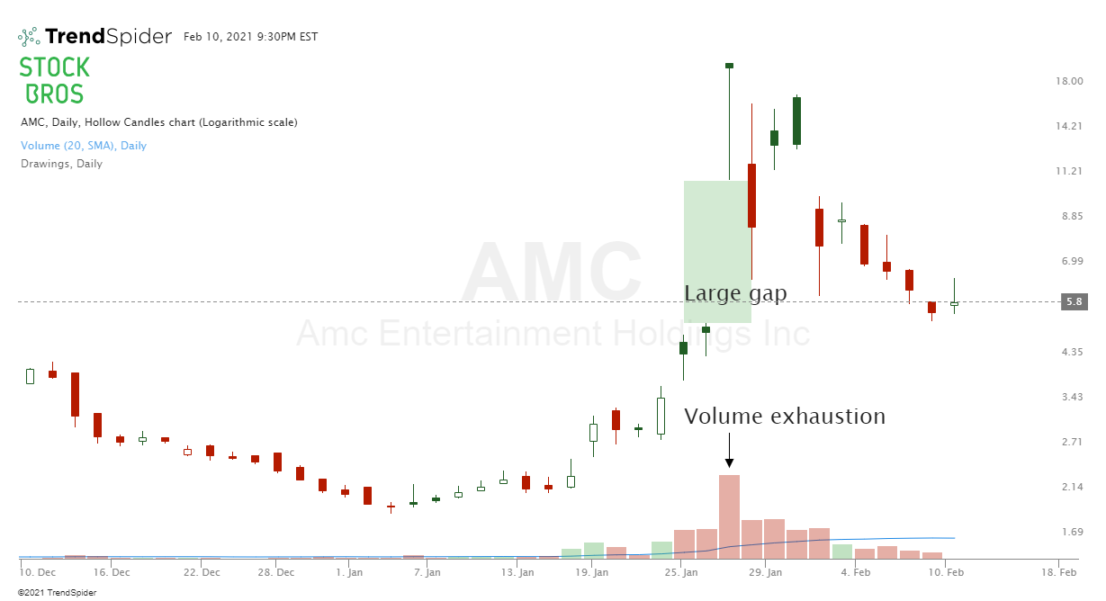 Keep in mind, a large gap on high volume does not necessarily mean that it is exhaustion volume. Only if the stock has been going up for a while, and has gone parabolic or close to it, can you consider it to be exhaustion after a large gap. Another example of volume exhaustion: As you can see in this massive rally in JKS (chart below), at one point, the first big red volume bar came in. That's your first sign to be cautious. Then, the stock continues to rally but on decreasing volume (see the down trending arrow at the bottom of the chart). A rally like that on decreasing bullish volume can also be a sign of exhaustion because buying volume is starting to dry up. This finally leads to the big red candle, accompanied by a big red volume bar. This candle took out the previous day's low, something that didn't happen for the entire trend. A break of an up trend, plus high selling volume = get out. 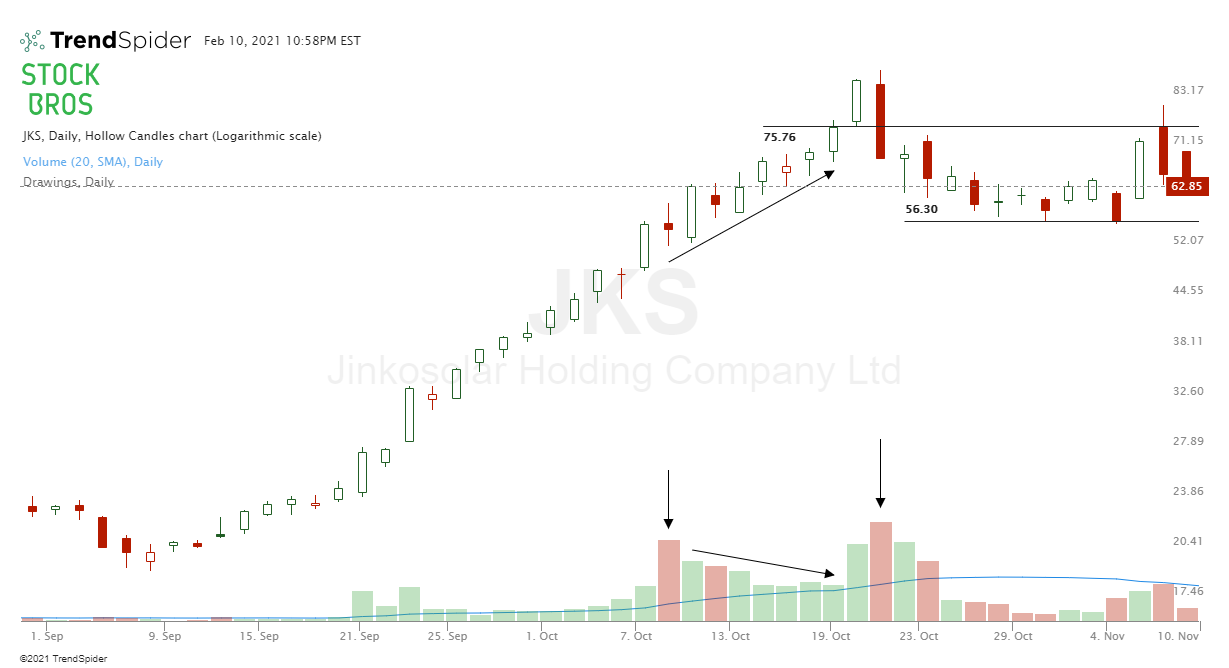 The sudden selling pressure in the example above is what we were talking about how selling volume can suddenly come in even while the stock seems unstoppable. When Do You Enter the Trade?This is subjective depending on your strategy, but hopefully we can help you find a way that suits you. Essentially, you should use volume in combination with other chart indicators/patterns. Using volume by itself isn't as effective in our opinion. The chart patterns tell the story pretty well. Look for classic chart patterns such as flags/pennants, ascending, descending, and symmetrical triangles, head and shoulders (including inverse h&s), double bottoms, etc. Even candlestick patterns like engulfing candles, which can be combined with moving averages. We recommend reading those highlighted articles as they will help with trade entries. We generally want to have 2 or 3 indicators telling us to take a trade. 1 may or may not be enough, and if you look for 10 indicators to line up, you may never even find a trade and your chart will look messy and confusing. Do you enter a trade on a break out or before the breakout near support? The answer is, both. Both entry methods can work as long as risk is managed properly. Risk management involves things such as taking partial profits along the way, raising stop losses when you are up on a trade to lower risk, and more. Below is an example of buying on a breakout, combined with other indicators. We'll explain. In the middle-left side of the chart, you'll note the heavy green volume, marked by the green arrow. Then, just before the trade entry, you can see the volume declining (red arrow) perfectly to the 20 exponential moving average. Then, an engulfing candle shows up on slightly higher volume than the previous 2 red days, while also breaking out of a range (the black trend line). Again, you can read our engulfing candle and moving average articles to get a better idea. 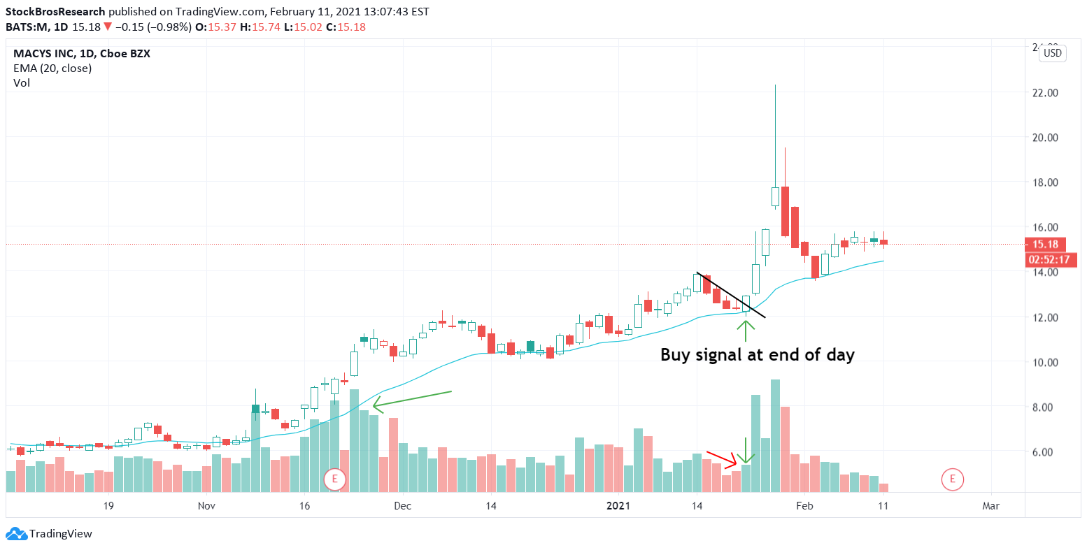 We usually wait for candle closes to confirm the pattern, so on the daily time frame we generally buy a few minutes before the end of the day or in after-hours if the stock is liquid enough, just so we know that the we will have the proper candle close. The next day on the trade above would have given you a nice profit, which you could have partially taken while simultaneously raising stop losses, or fully taken the profit and moved on to the next trade. Using Volume by Price as an IndicatorAnother popular volume indicator that we sometimes use is called volume by price. It looks like this (the orange bars on the right side of the chart). 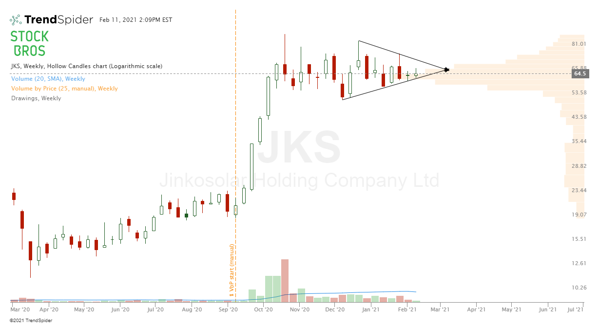 Keep in mind, stockcharts.com and TrendSpider offer volume by price, while TradingView does not (unless we're mistaken). What's Volume by Price?Volume by price shows the amount of volume that traded at a specific price during a specific period of time. Regular volume bars are based on each candlestick/bar, while volume by price looks only at the price. These areas of volume can be used to identify potential support and resistance levels on a chart. Finding Support and Resistance Levels With Volume By PriceLet's put it simply. If a large volume area is ABOVE the current price, it can act as resistance. If a large volume area is BELOW current price, it can act as support. Using this chart as an example, we can see that the low volume above the current price suggests that there isn't much resistance above. Also, the largest volume block is just under the current price, suggesting that it's an area of support. Combined with the bullish chart setup, this is most likely a good bullish trade. 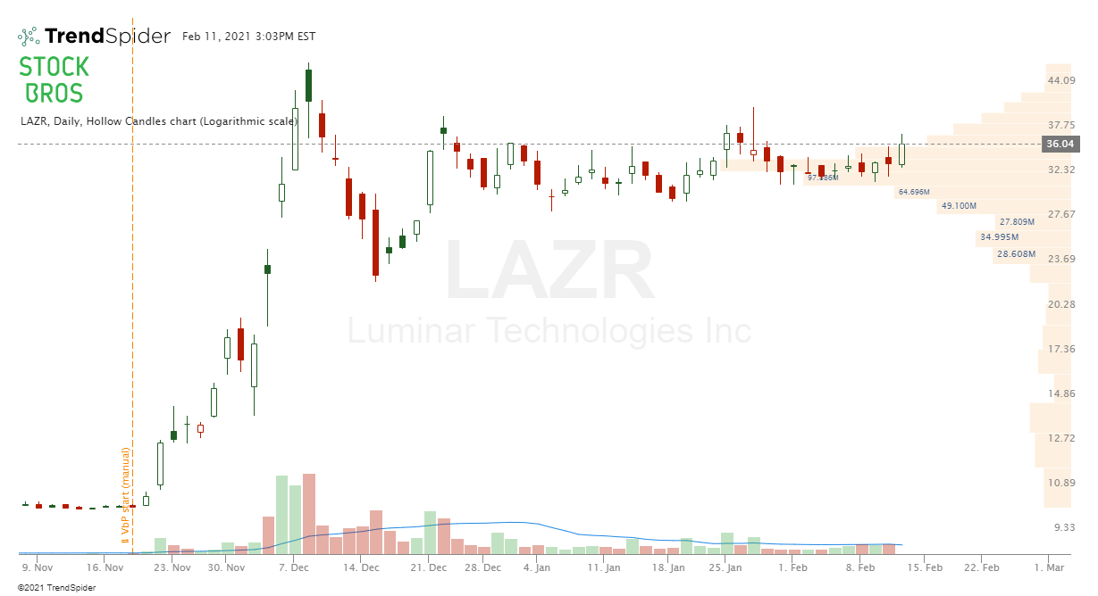 Volume setups like the one above can act as launchpads for a move higher. This is because volume is building up at that level and then breaking above it. Lots of people are long at the big volume level, and there aren't many people long at higher prices. If there were many people long at higher levels, they could act as sellers as soon as their trade reached break even, creating a resistance point. Setting Up Volume By Price on a ChartLet's use TrendSpider for example. When searching for an indicator, simply type "volume by price" and you will find it. You can see our setup below. The higher the number in the "columns" setting, the more detailed the volume analysis will be at each price. The "manual" that we have in the "Anchor to" setting means that we can manually decide what time period we want to start our volume analysis from. You can also make it automatically anchor based on things such as highest high, lowest low, highest volume, and more if you don't want to anchor it yourself. We will explain more about anchoring below. 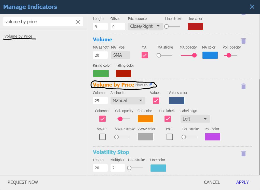 Below, you can see the anchor in the chart (the orange vertical line). This means that we decided to anchor the volume from that point on. There is no exact method of where to anchor volume from, but we generally anchor from the beginning of a big move. In this scenario, we picked the very beginning of a major move. 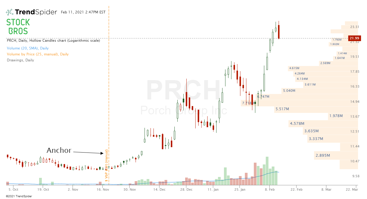 You can also anchor the shorter-term recent swing low to find more short-term support/resistance levels. Find a method that suits you, and put it to use. 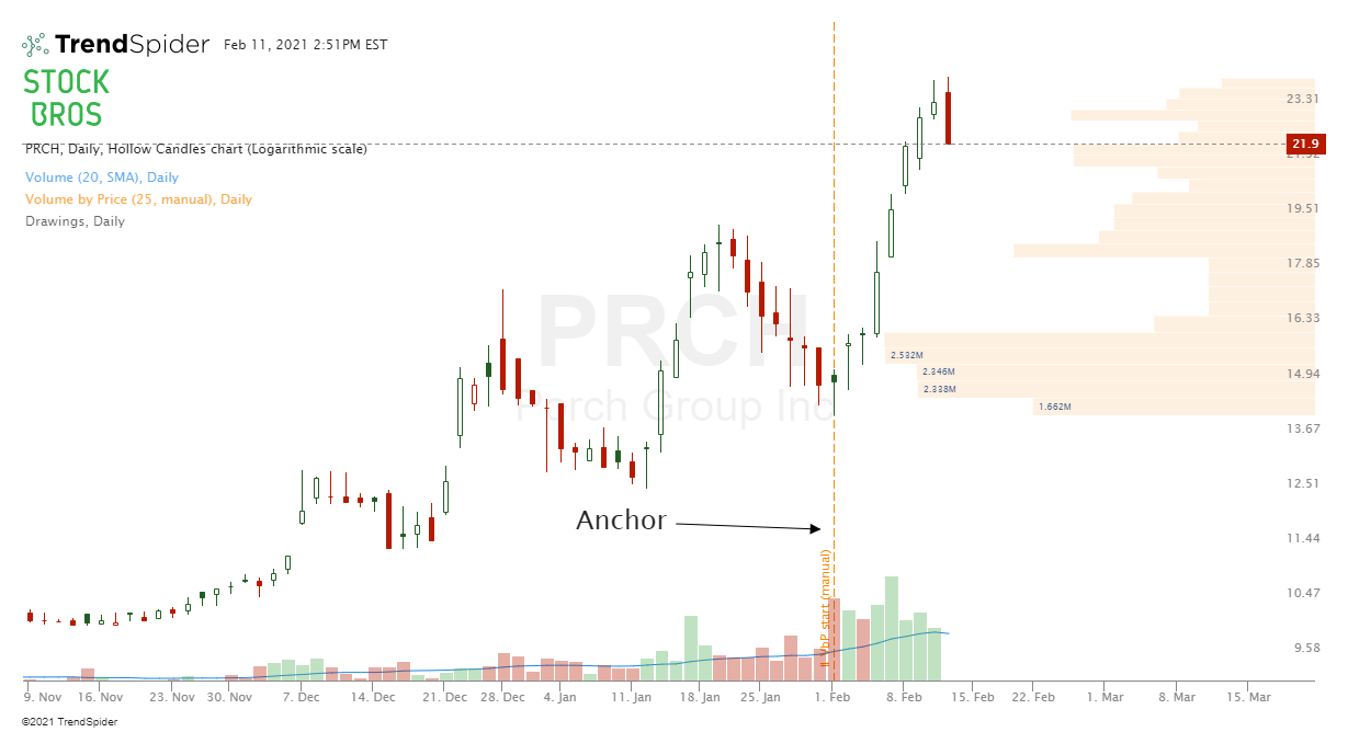 ConclusionWe think volume is a great indicator to have on a chart that can be used to predict the potential strength in stock movement, and to find support and resistance levels. The charts we included were all on the daily time frame, but the good news for day traders is that this also works for shorter time frames. Just make sure you have accurate volume data if you are trying to day trade because you need as much of an edge as possible. Try adding volume indicators to your charts and play around with them to see if you find the same patterns we talked about or new patterns! As with all indicators, volume is stronger when combined with things such as classic chart patterns, trend analysis, moving averages, candlestick patterns, etc. The more things line up in your favor, the higher the odds. Need Chart Software?TrendSpider is a top-tier charting platform where traders can put their technical analysis skills to work. It offers automated technical analysis tools, dynamic price alerts, back testing, 1-on-1 training sessions for those who need extra help, and more. A very unique tool that TrendSpider has is Raindrop Charts, which can give you a great edge with your trading. Get 10% off TrendSpider plans by clicking here & using the coupon code TS10 when signing up.  Another great charting platform that we would recommend for serious traders is TradingView. We use often as it has many useful tools and is very customizable. There is also an active trading community where people from all over the world post their trade ideas, so you never run out of ideas.  Thanks for reading! If you enjoyed this article, please consider following us on twitter @StockBrosTrades and/or subscribing to our free newsletter to get articles like this sent to you when they are posted! Related Category Related Articles
GET 2 FREE STOCKSGet 2 FREE stocks when you sign up for Webull and deposit $5. Webull is an easy-to-use, commission-free trading platform with no monthly fees that offers stock, ETF, options, and cryptocurrency trading. Click here to sign up and get free stocks!  |
 Categories
All
Archives
September 2022
|
 RSS Feed